Product Design
Tred
Designing the complete app and brand for the UK's leading green neo-bank: from first sketch to App Store launch.
Overview
Tred is a UK-based neo-bank that helps customers understand and reduce their individual carbon footprint. As the first and only full-time designer, I owned the end-to-end experience: mobile app, debit card, website, and brand. I worked closely with engineers and stakeholders to ship Beta within 12 months of joining.
- Role
- Lead Product Designer
- Timeline
- 16 months
- Platform
- iOS & Android
- Result
- 1,400+ users, 30,000 on waitlist
The problem
Climate change is a real problem but people don't know how to act on it individually. Banks provide no visibility into the carbon footprint of your spending. Tred needed to make that data visible, actionable, and motivating, without being preachy.
The solution
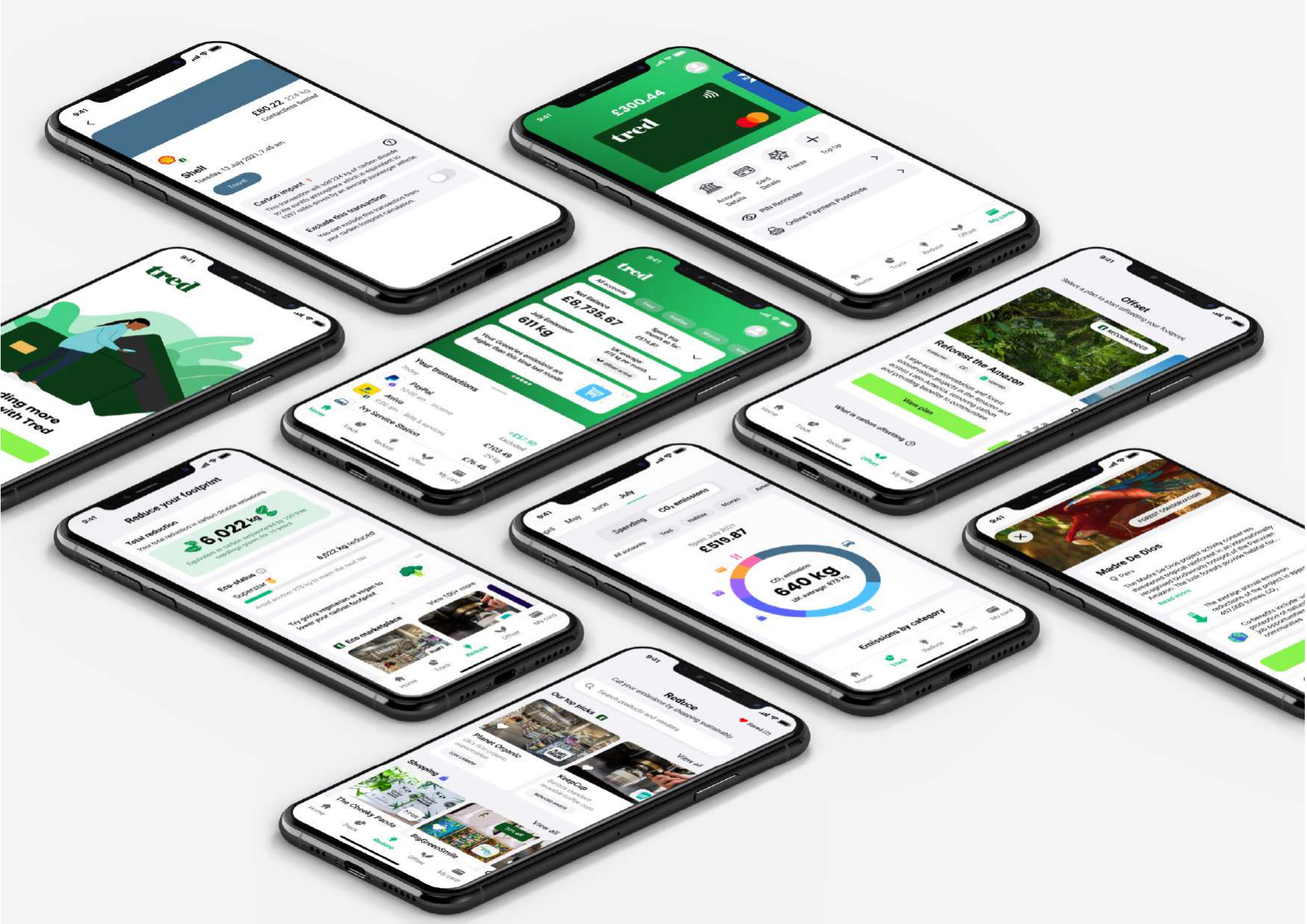
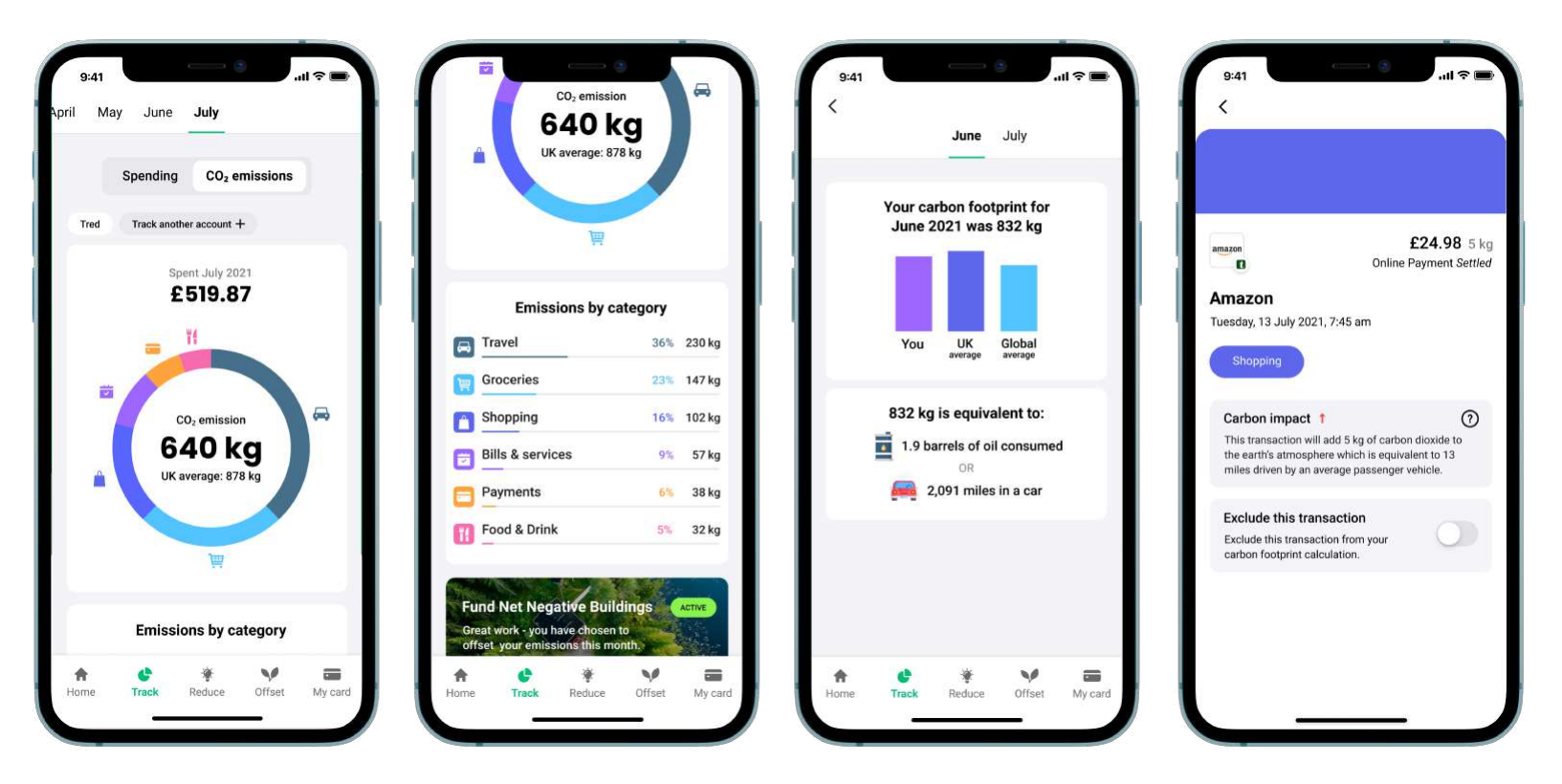
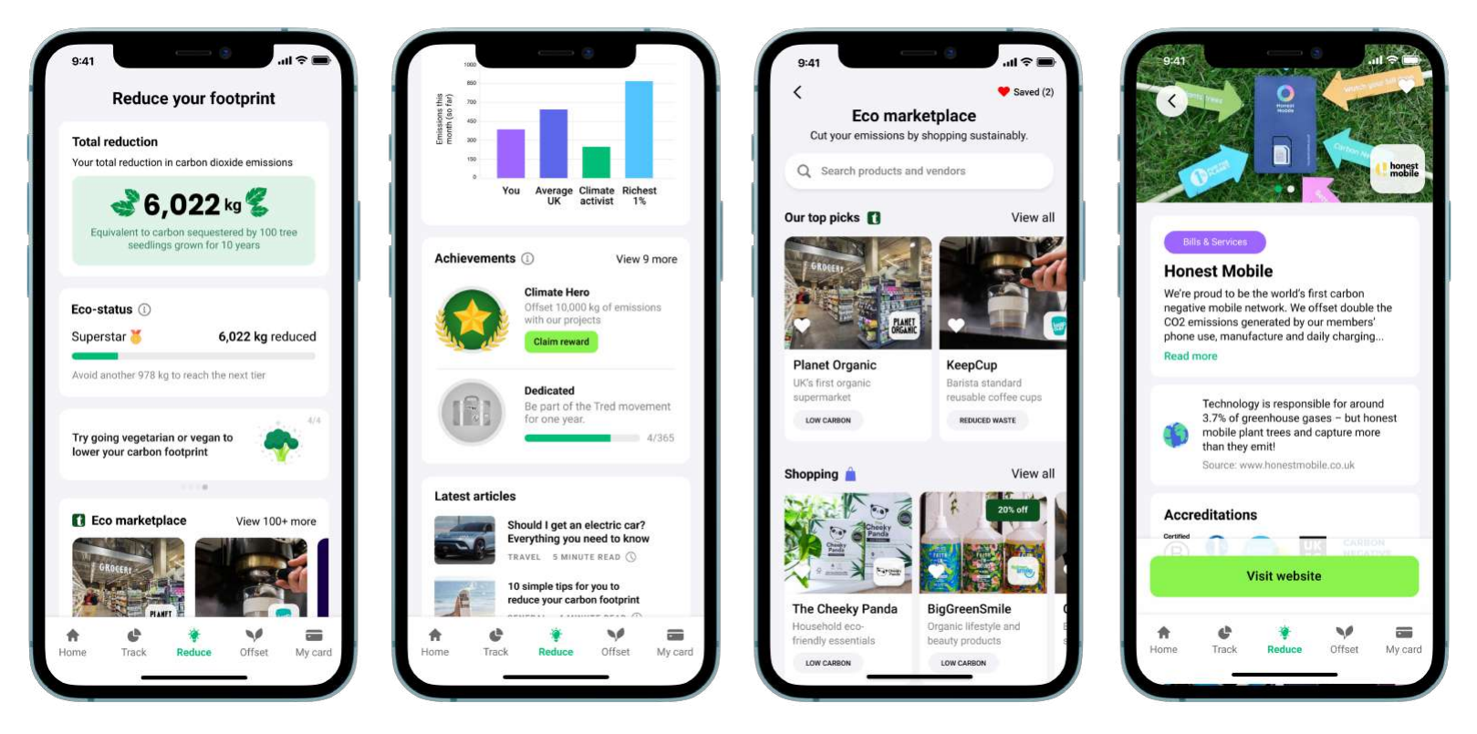
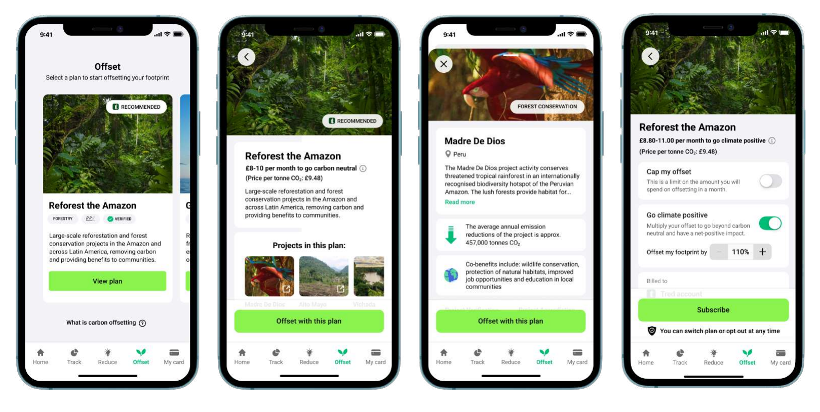
The Tred debit card and app let users track, reduce, and offset their carbon footprint automatically as they spend. Every transaction is categorised and scored. Users can fund offset projects, browse eco-friendly alternatives, and see their real environmental impact.
Design empathy
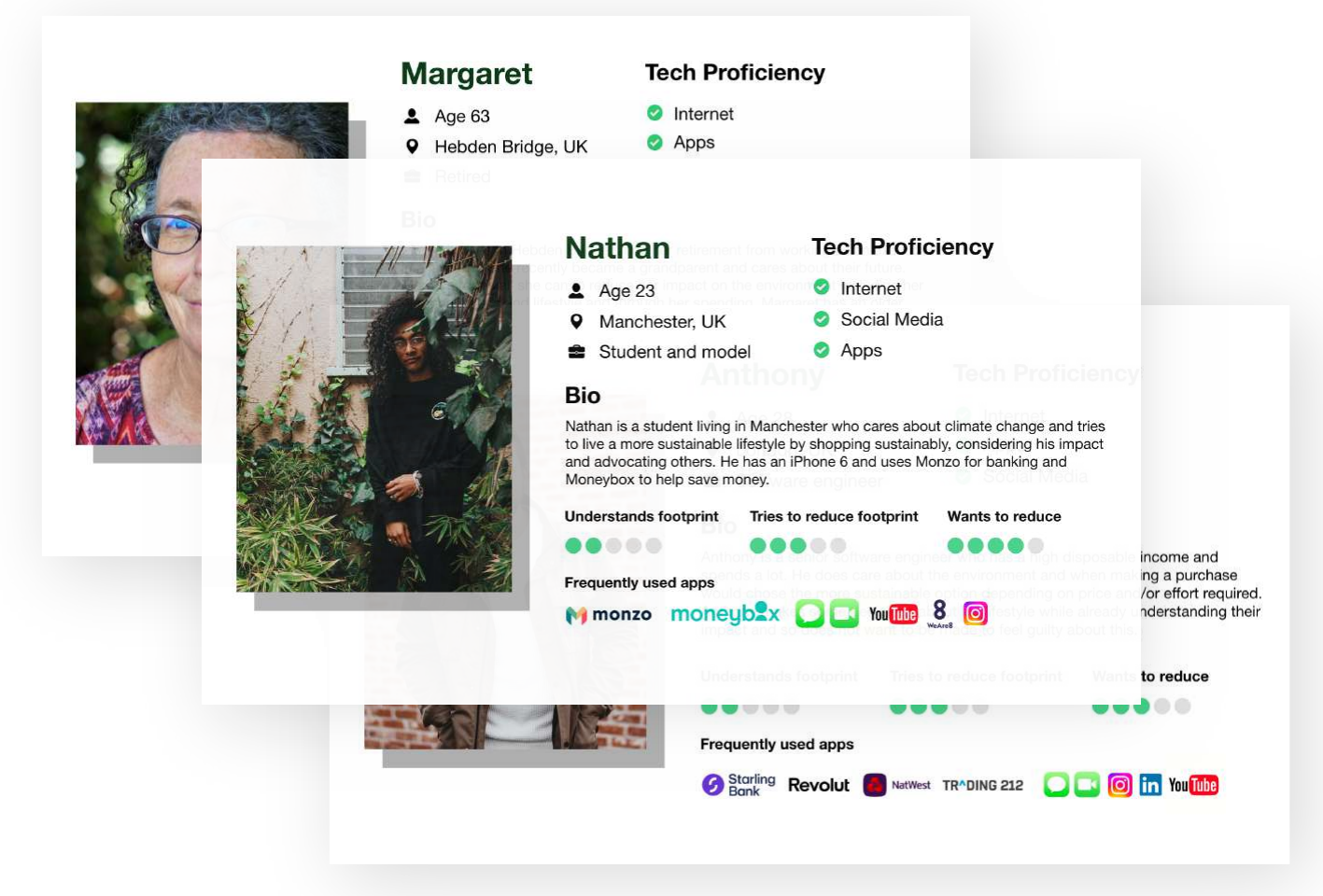
Early in the process I created user personas to help the team empathise with real users rather than designing for a generic 'user'. This opened up key questions and shaped every design decision that followed.
Ideation
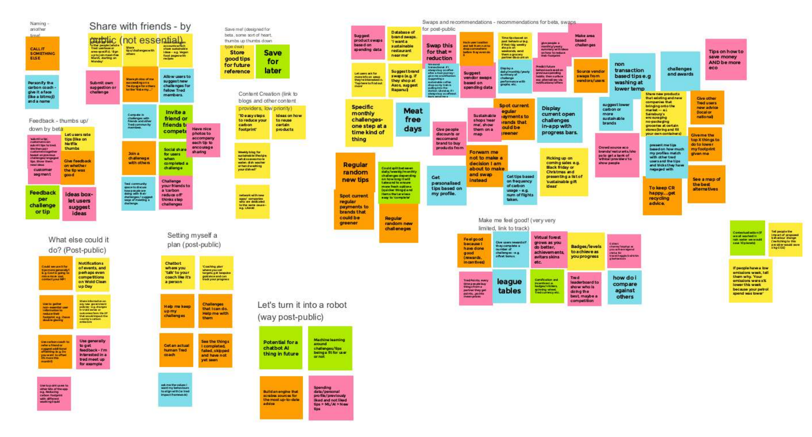
We held whole-team workshop sessions to generate product feature ideas for the Beta release: sticky notes grouped by theme and priority.
Competitive analysis
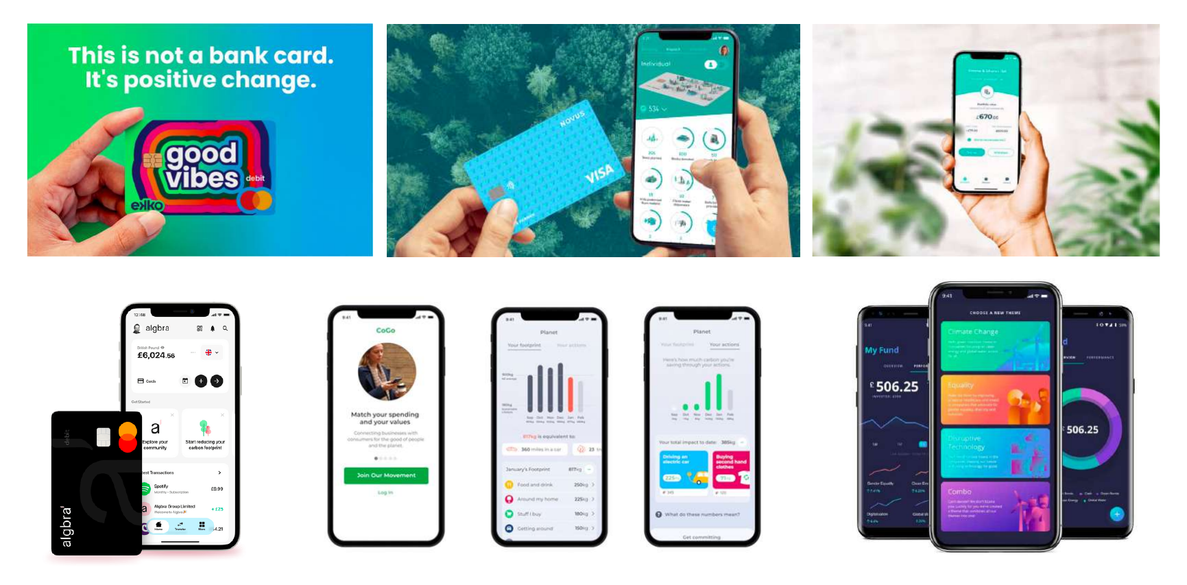
We analysed both eco-focused and challenger banking apps to understand what was working in the market, and where the gaps were.
Information architecture
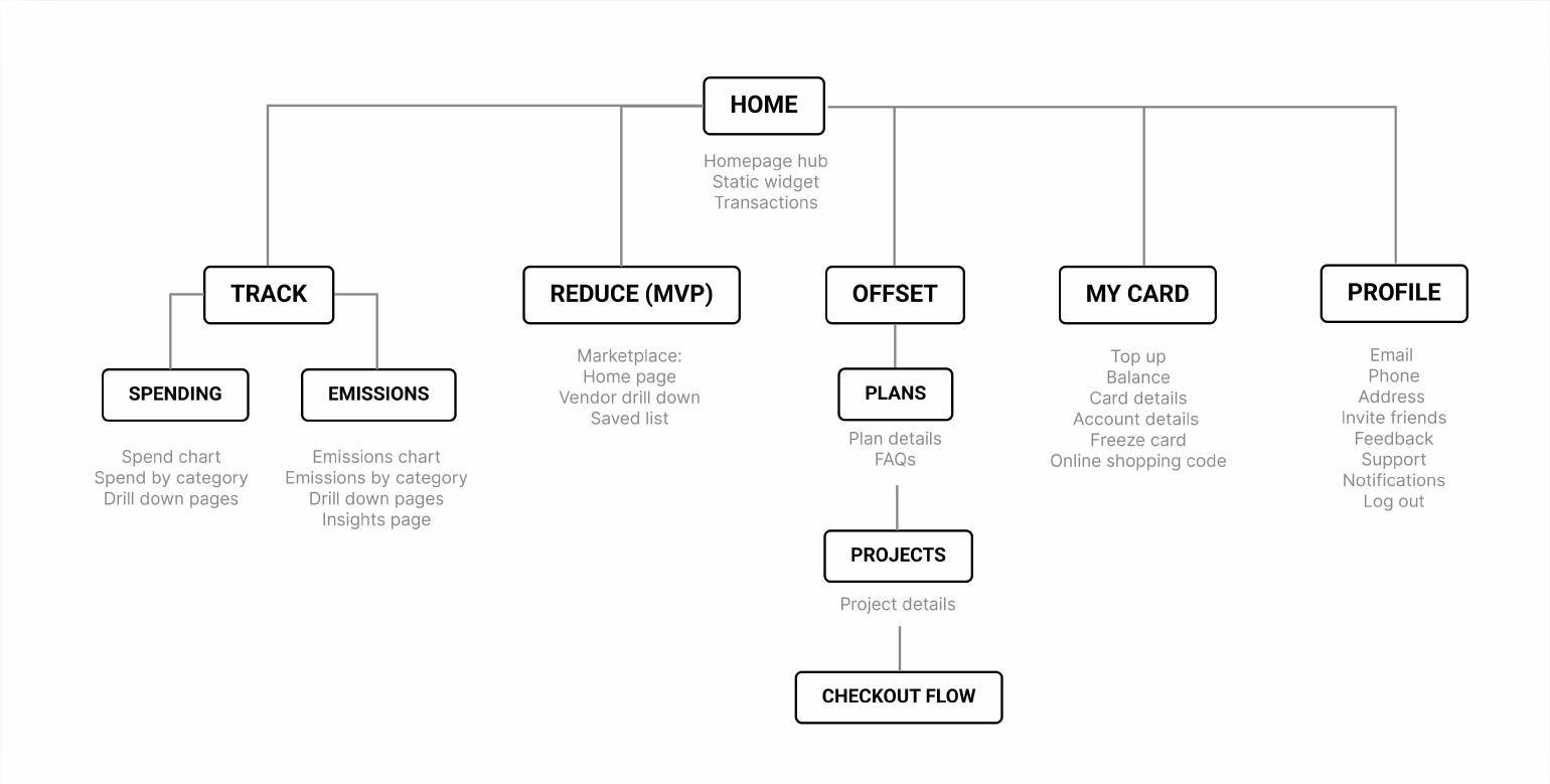
Reducing a complex fintech product into a clear, navigable structure was one of the core challenges: the IA shows the full page and feature layout for the Beta release.
Sketches & wireframes
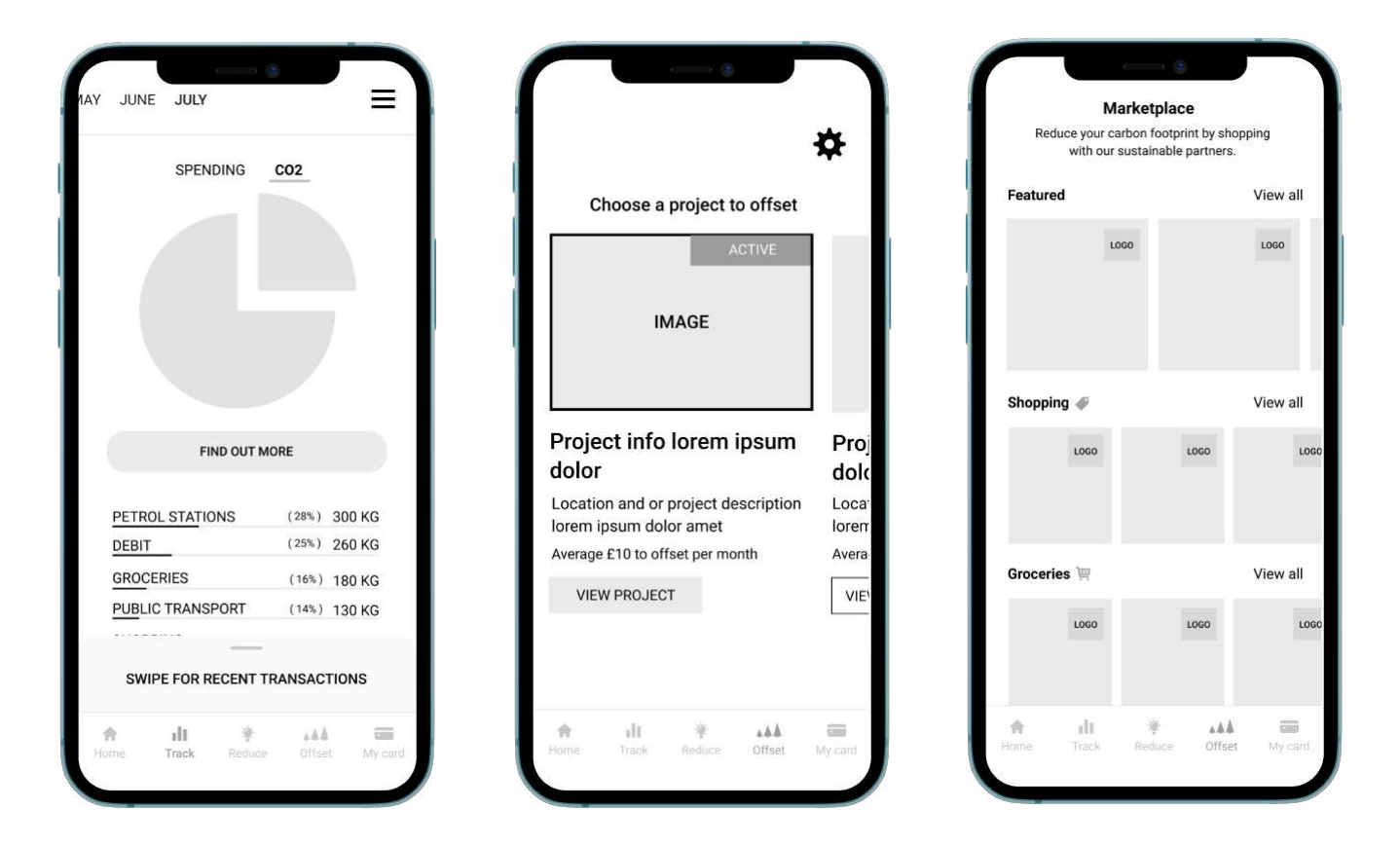
Wireframing was used to explore layouts quickly and get provisional sign-off before moving into high-fidelity design. Lo-fi kept the conversation on structure, not polish.
App flows
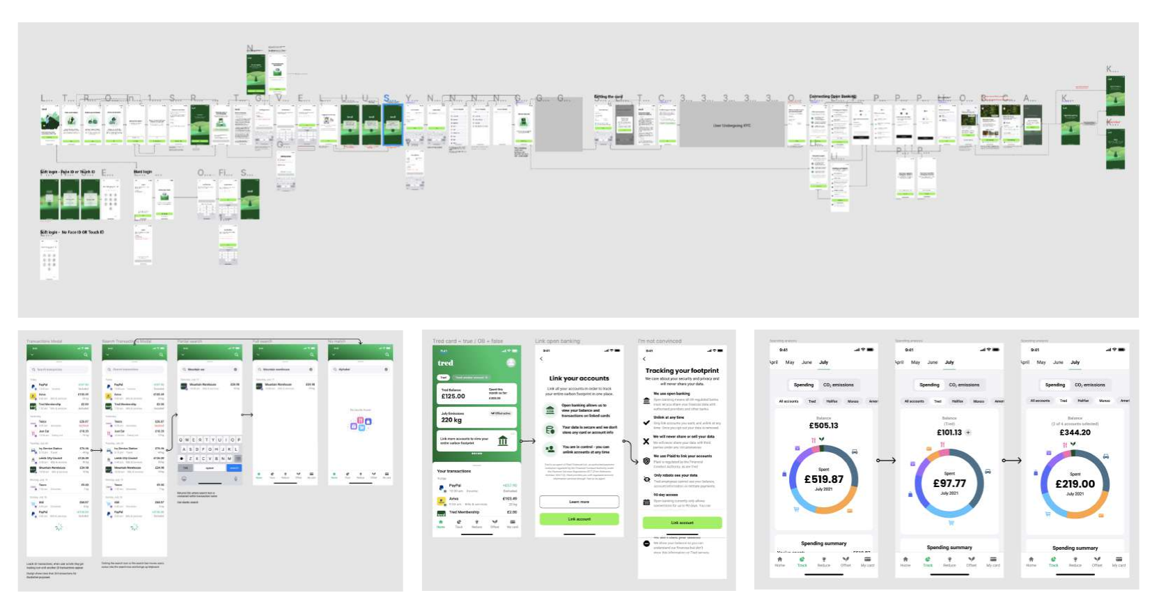
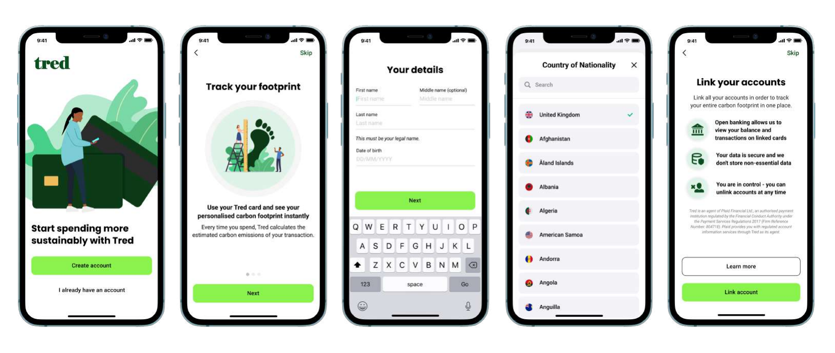
Mapping the onboarding flow was particularly challenging: Tred requires a KYC process as part of signup. Despite this, we structured the happy path to require fewer clicks than any of the major UK banks.
User testing
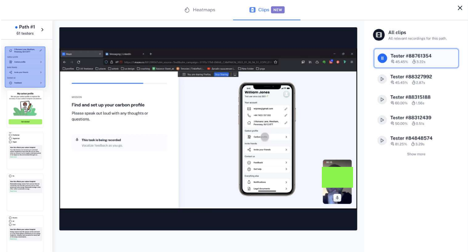
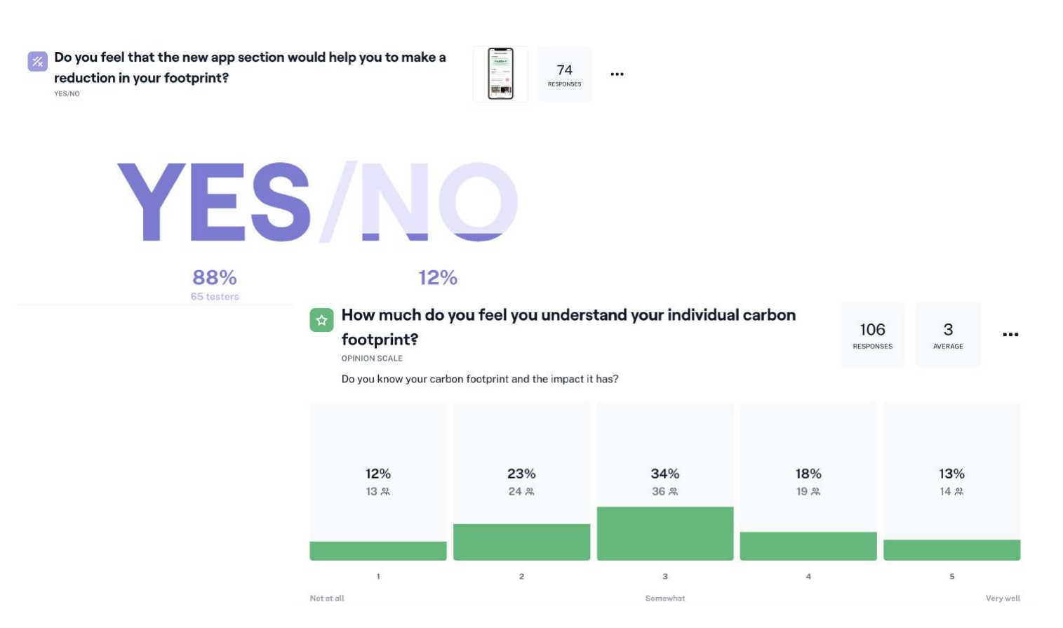
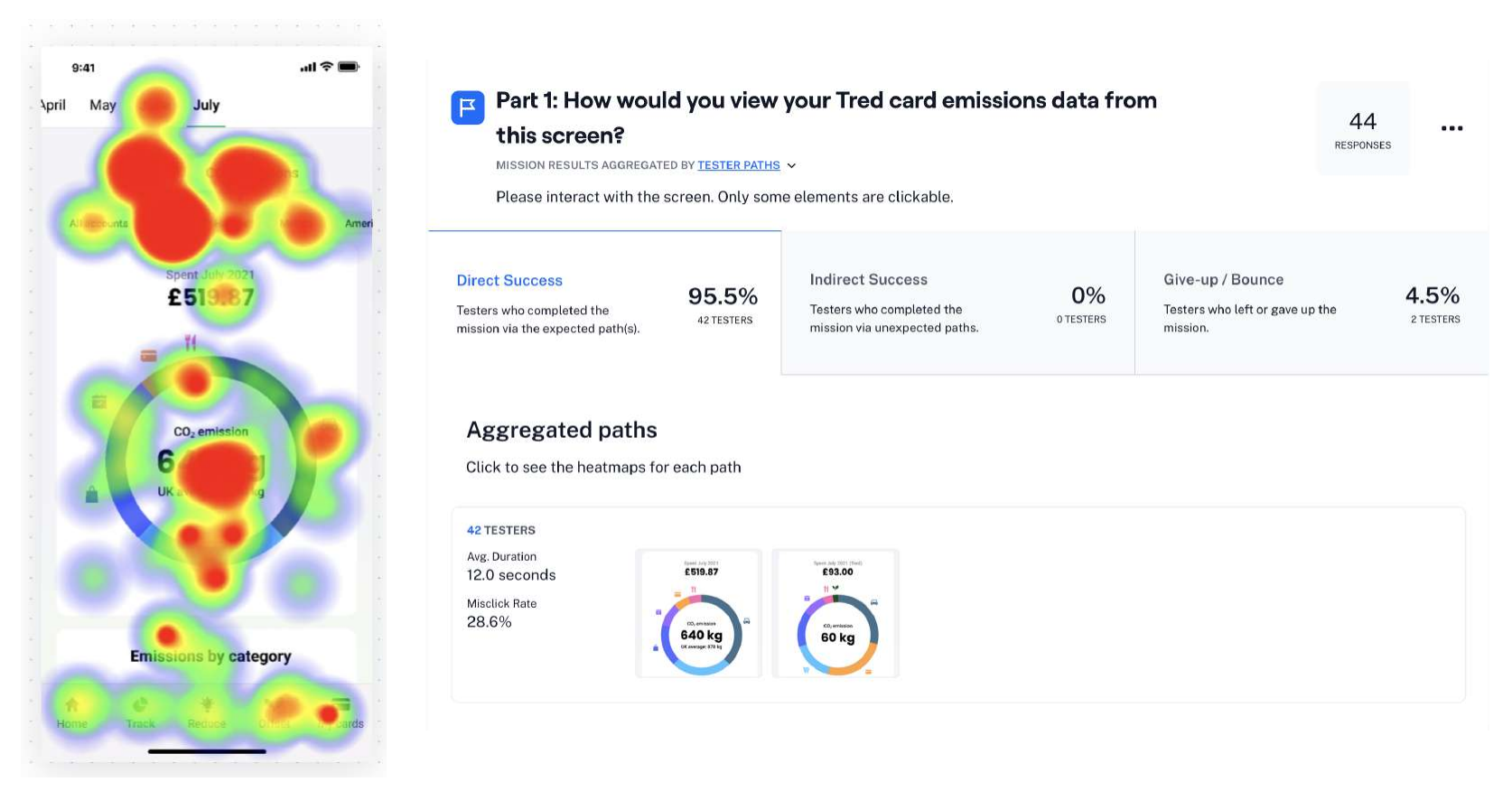
We kept waitlisted users involved throughout. Initially we tested over video call with Figma prototypes, then moved to unmoderated testing with Maze to scale our reach. Testing allowed us to validate assumptions and catch issues before they reached Beta: usability testing showed a 95.5% direct task success rate, with core flows completed in an average of 12 seconds.
Final designs
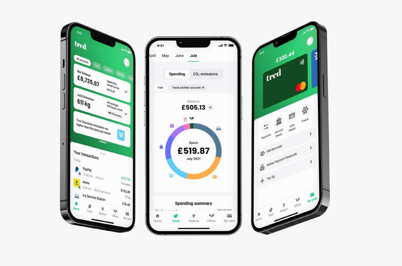
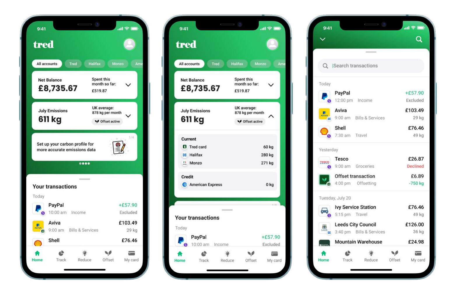
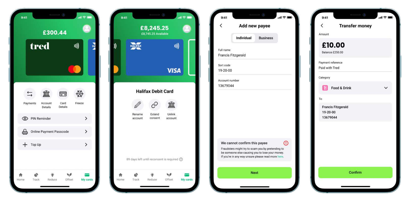
The final app shipped on iOS and entered private Beta on Android. Below are screens from the four core sections of the app.
Core screens
The five sections users move between most: from checking their balance to offsetting their footprint.
Card design
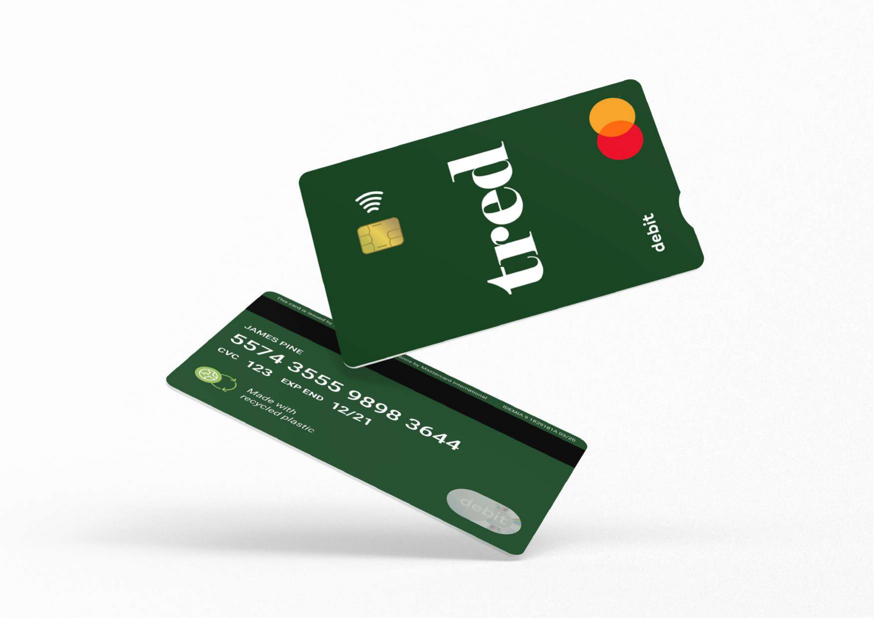
The Tred debit card needed to stand out and signal the brand's values: sustainable, modern, serious about the planet. Made from recycled plastic.
Waitlist subscribers at launch
Active Beta users
Zero to shipped on iOS & Android
Direct task success rate in usability testing